Each week the Center for Disease Control and Prevention (CDC) prepares the “Morbidity and Mortality Weekly Report” (MMWR).
A careful look at the graph from these weekly reports shows encouraging news. The red line below shows the percent of deaths due to Pneumonia, Influenza and COVID-19. A normal death rate for these symptoms seasonally varies from about 6 to 8 percent, according to the CDC graph below.
During the 2018-2019 flu season, the 2018 portion of this CDC graph shows a peak of 11% death rate. As of August 20, 2020, the pneumonia, influenza and COVID-19 death rate peaked in late April and early May at about 28%.
The graph below shows data through the week ending August 15. 2020 mortality rate (%) has decreased to BELOW some 2018 levels. The red line also shows a rapid weekly decline in death rate since about July 20, 2020.
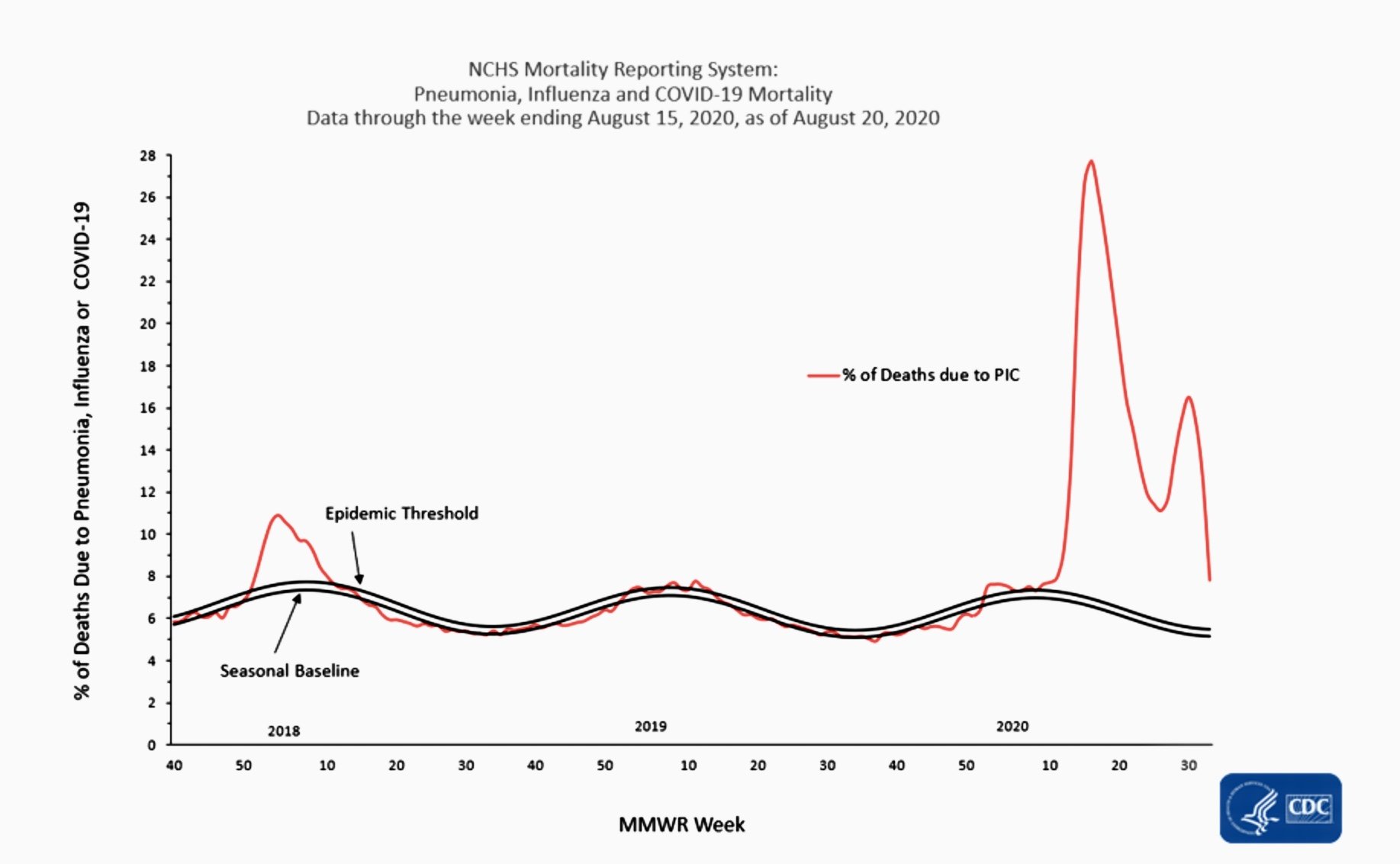
Epidemic threshold (top of 2 wavy parallel lines) delineates the maximum normal seasonally variable death rate which peaks in winter and declines during summer.
We will continue to watch the death rate of Pneumonia, Influenza and COVID-19 cases and report this changing data.